
Embedding
Visual embedding workflow
SmooSense uses LanceDB as its storage engine for embeddings and vector indexes.
LanceDB is an innovative columnar storage format built specifically for AI and vector-search workloads. It offers near-zero cost at idle while being able to scale up rapidly under spiky or bursty query loads, making it well suited for interactive and exploratory AI use cases.
1. Compute or ingest embedding#
To work with embedding, please install SmooSense with embedding feature
uv tool install -U "smoosense[emb]"1.1 From images#
Run sense-images ./images/*.jpg. It will run a Python script that computes OpenAI Clip and Facebook Dino v2
embedding, creates a Lance table, builds vector index and opens it in your web browser.
1.2 From videos#
Run sense-videos ./videos/**/*.mp4. It will run a Python script that computes OpenAI clip embedding for the first
frame of the video, creates a Lance table, builds vector index and opens it in your web browser.
1.3 From parquet files#
We also provide a CIL tool to convert parquet files to lance. It will also detect columns having a equal-size float/double arrays, convert to pyarrow FixedSizeListArray, and build vector index in the lance file.
parquet-to-lance --help
Usage: parquet-to-lance [OPTIONS] PARQUET_PATH LANCE_PATH
Convert a Parquet file to Lance format.
PARQUET_PATH: Input Parquet file
LANCE_PATH: Output Lance table path
• Parent directory = database
• Basename = table name
• Example: /db/my_table.lance → db=/db, table=my_table
Features:
✦ Converts float[]/double[] to fixed-size arrays
✦ Builds vector index for embeddings (dim > 10)
✦ Appends as new version if table exists
Examples:
parquet-to-lance data.parquet ./my_db/my_table.lance
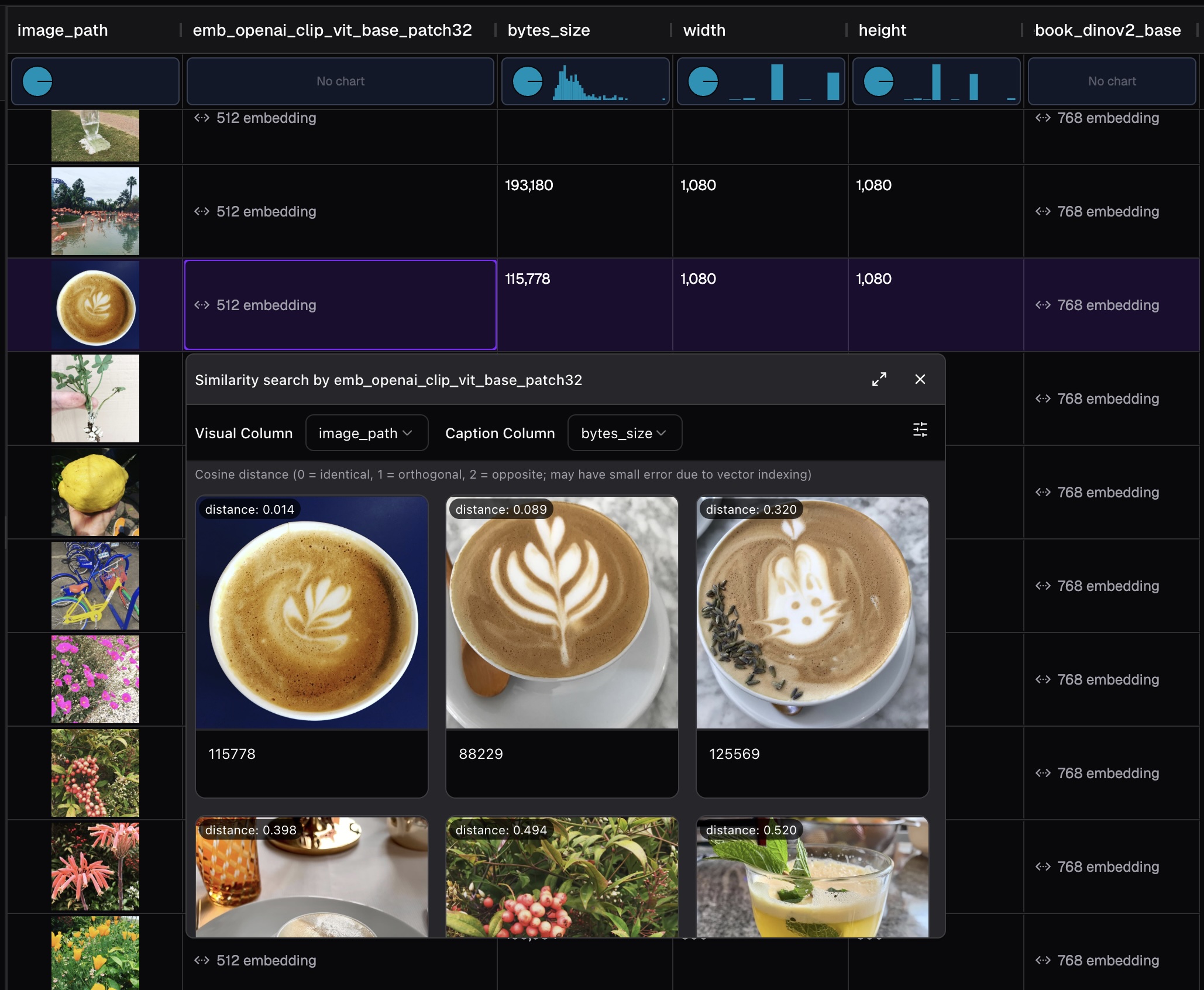
parquet-to-lance emb.parquet /data/lance_db/embeddings2. Similarity search with embedding#
SmooSense integrated vector search with Lance index. When a vector index is found, you can run vector search with a single click.
3. Interactive UMAP visualization#
UMAP (Uniform Manifold Approximation and Projection) reduces high-dimensional embeddings to 2D coordinates for visualization while preserving the structure of your data.
SmooSense computes UMAP projections on-the-fly from your embedding columns and renders them as interactive scatter plots.
3.1 Features#
- Hover preview: Hover over any point to see the image, audio, or video preview
- Lasso selection: Draw a lasso to select multiple points and view them in a gallery
- Color by category: Use a categorical column to color points by group (creates separate traces with legend)
- Color by value: Use a numerical column to color points by continuous value (uses color scale)
- SQL filtering: Filter data with SQL conditions before computing UMAP
- Adjustable parameters: Fine-tune
n_neighborsandmin_distto control the projection
3.2 Parameters#
3.3 Performance#
- UMAP computation runs in parallel using all CPU cores
- For large datasets (>1,000 rows), SmooSense automatically samples to keep visualization responsive
- Results include runtime and sampling info in the status bar
3.4 Try UMAP visualization yourself#
Explore image embeddings with UMAP visualization. Note that this demo only shows the interactive visualization. For full functionality please run SmooSense on your computer.
👇 Live demo
https://demo.smoosense.ai/example/emb-images4. Balance map#
People turn to semantic balance analysis using embeddings when they need to understand whether their dataset is fair, representative, and structurally complete: not just in terms of raw counts, but in terms of meaning. Traditional distributions can show how many samples fall into each category, but only embeddings reveal deeper patterns: whether certain concepts dominate, whether clusters are missing or underrepresented, whether two groups that "look balanced" numerically are actually very different semantically. This is crucial in ML, robotics, recommendation systems, audio/vision datasets, and any scenario where meaningful coverage matters more than labels alone.
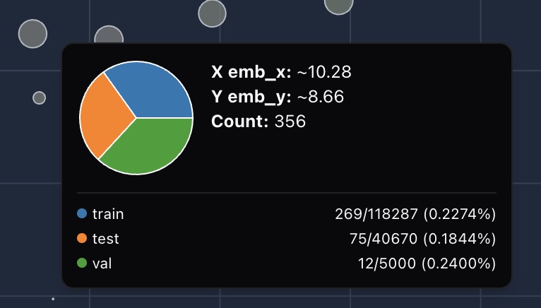
BalanceMap in SmooSense makes this effortless by visualizing embedding space as bubble plots, computes relative ratio, and colorize by the level of imbalance.
4.1 Ratio-based color encoding for balance#
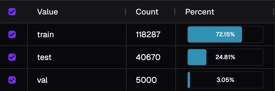
Color isn't determined by raw counts, but by relative balance across breakdowns (e.g., training/validation/test splits). This is because groups of the breakdown inherently have different size. Image below shows the distribution of fold. If we colorize by counts, then you will only see information from training fold.
For each bubble, we compute the ratio of samples of that bubble within its breakdown group:
We then compare these ratios across groups:
4.2 Try BalanceMap yourself#
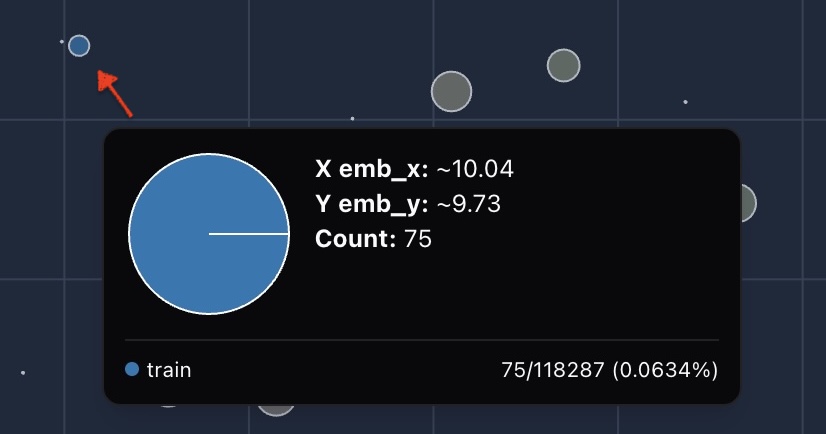
Zoom in and drag around, you can easily find a blue cluster where all the data is in train fold, no testing or validation at all.
5. More#
Full embedding features (search, clustering etc) are coming.